Fundamentals of Statistics

Before starting with the details of machine learning, let us first recap some fundamental concepts of statistics. These are the terms that you will use again and again if you stick with the business of machine learning. Machine learning is a science, but it is also a form of painting: statistics and mathematics are like the paint and the brush strokes.
In this lecture we will go through a small but important chain of ideas:
Probability distributions: how we assign probabilities to possible outcomes.
Binomial distribution: the simplest repeated-trial model, useful for heads/tails, pass/fail, signal/background counting, etc.
Gaussian distribution: the familiar bell curve that appears in measurement errors, detector resolutions, averages, and many approximation arguments.
Likelihood: how the same formula becomes a function of the unknown parameter after the data are observed.
Histograms: how data give us an empirical picture of a distribution.
Surprise, Shannon entropy, and Gini index: three related ways of quantifying uncertainty or impurity.
Probability distribution function
Let us first jump into the definitions of a probability distribution functions (PDF). A random variable is a mathematical object that assigns a number to the outcome of an experiment. For example:
the number of heads in 10 coin tosses,
the transverse momentum of a particle in a detector,
the number of events passing a selection cut,
the energy recorded in a calorimeter cell.
The probability distribution tells us how probability is spread over the possible values of the random variable. They come in two flavours discrete and continuous. To be worthy of being a probability distribution both of them have to obey some properties.
Discrete probability distribution
The probability distribution of a discrete random variable is a list of probabilities associated with each of its possible outcomes. It is also sometimes called the probability mass function (PMF). Suppose a random variable may take different values, with the probability that defined to be . Then the probabilities must satisfy the following:
1: 0 < < 1 for each
2: .
Binomial distribution
This is the distribution where only two outcomes are possible, success and failure with probabilities and . Then the probability of successes in trials is
import numpy as np
import matplotlib.pyplot as plt
import seaborn as sns
from scipy.stats import norm, binom # For binomial distribution alreayd defined
from math import comb
import ipywidgets as widgets
from IPython.display import display

def binomial_pmf(k, n, p):
    return comb(n, k) * (p ** k) * ((1 - p) ** (n - k))

def plot_binomial(n, p, k_highlight):
    k = np.arange(0, n + 1)  # Possible number of successes
    probs = np.array([binomial_pmf(ki, n, p) for ki in k])  # PMF values

    plt.figure(figsize=(10, 6))
    markerline, stemlines, baseline = plt.stem(k, probs)
    plt.setp(markerline, color='b', label="PMF")
    plt.setp(stemlines, color='b')

    # Highlight one point in red
    if 0 <= k_highlight <= n:
        plt.plot(k_highlight, binom.pmf(k_highlight, n, p), 'ro', label=f"P(X={k_highlight})")

    plt.title(f"Binomial Distribution PMF (n={n}, p={p})")
    plt.xlabel("Number of Successes (k)")
    plt.ylabel("Probability")
    plt.legend()
    plt.grid(True)
    plt.show()

widgets.interact(
    plot_binomial,
    n=widgets.IntSlider(value=10, min=1, max=50, step=1, description='Trials (n)'),
    p=widgets.FloatSlider(value=0.5, min=0.01, max=1.0, step=0.01, description='Success Prob (p)'),
    k_highlight=widgets.IntSlider(value=5, min=0, max=50, step=1, description='k Highlight')
)<function __main__.plot_binomial(n, p, k_highlight)>❓ Exercise
Q1: For a binomial distribution with , and success probability of , what is the probability of getting 10 successes?
Click to show answer
Answer: The result is 0.02798. You can check this by using the function binomial_pmf(10, 30, 0.5).
❓ Exercise
Q2: When is the binomial distribution most symmetric?
Click to show answer
Answer: A binomial distribution is most symmetric when p = 0.5.
Continuous probability distribution
As the name suggests in this case the outcomes can take any continuos value. In this case one can only talk about outcomes between some number to another. For example, in this case it is fare to ask the question what is probability of some random outcome , to be in the range . The curve, which represents a function , must satisfy the following:
1: The curve has no negative values ( for all values of ).
2: The total area under the curve is equal to 1.
Gaussian Distribution
The Gaussian or normal distribution, is something you will find everywhere in Data science. Sometimes this is one of the assumptions for many data science algorithms too.
A normal distribution has a bell-shaped density curve described by its mean and standard deviation . The density curve is symmetrical, centered about its mean, with its spread determined by its standard deviation showing that data near the mean are more frequent in occurrence than data far from the mean. The probability distribution function of a normal density curve with mean and standard deviation at a given point is given by:
For more mathematically oriented people, you can plug into this distribution and confirm
def plot_normal(mu, sigma):
    x = np.linspace(mu - 8*sigma, mu + 8*sigma, 1000)
    y = norm.pdf(x, mu, sigma)
    plt.figure(figsize=(8, 4))
    plt.plot(x, y)
    plt.xlim(-20, 20)
    #plt.ylim(0, 20)
    plt.title("Gaussian Distribution")
    plt.grid(True)
    plt.show()

widgets.interact(plot_normal, mu=(-5, 5, 0.5), sigma=(0.1, 5.0, 0.1))<function __main__.plot_normal(mu, sigma)>def plot_normal(mu, sigma, x_min, x_max):
x = np.linspace(mu - 5*sigma, mu + 5*sigma, 1000)
y = norm.pdf(x, mu, sigma)
# Make sure the lower limit is smaller than the upper limit
a = min(x_min, x_max)
b = max(x_min, x_max)
# Probability between x_min and x_max
probability = norm.cdf(b, mu, sigma) - norm.cdf(a, mu, sigma)
plt.figure(figsize=(10, 6))
plt.plot(x, y)
# Shade the selected region
x_shade = np.linspace(a, b, 500)
y_shade = norm.pdf(x_shade, mu, sigma)
plt.fill_between(x_shade, y_shade, alpha=0.3)
# Mark the boundaries
plt.axvline(a, linestyle="--")
plt.axvline(b, linestyle="--")
plt.xlim(-8, 8)
#plt.ylim(0, 20)
plt.title(
f"Gaussian Distribution\n"
f"P({a:.2f} ≤ X ≤ {b:.2f}) = {probability:.4f}"
)
plt.grid(True)
plt.show()
widgets.interact(
plot_normal,
mu=(-5, 5, 0.5),
sigma=(0.1, 5.0, 0.1),
x_min=widgets.FloatSlider(value=-1.0, min=-5.0, max=5.0, step=0.1, description='x min'),
x_max=widgets.FloatSlider(value=1.0, min=-5.0, max=5.0, step=0.1, description='x max')
)<function __main__.plot_normal(mu, sigma, x_min, x_max)>Likelihood vs Probability
The same mathematical expression can be read in two different ways depending on what is fixed and what is allowed to vary.
Probability: the parameters are fixed, and we ask how probable the data are.
Likelihood: the data are fixed, and we ask which parameter values make the observed data more plausible.
Example:
Probability: “Given (p=0.7), what’s the probability of 3 heads in 5 tosses?”
Likelihood: “Given 3 heads in 5 tosses, what is the most likely value of (p)?”
# Likelihood visualization for a coin-toss example.

def plot_likelihood(total_flips, obs_heads):

    # A physically meaningful case must have obs_heads <= total_flips
    if obs_heads > total_flips:
        print("Number of observed heads cannot be larger than the total number of flips.")
        print(f"Here obs_heads = {obs_heads}, but total_flips = {total_flips}.")
        return

    p_vals = np.linspace(0.001, 0.999, 500)
    likelihoods = binomial_pmf(obs_heads, total_flips, p_vals)

    # Maximum likelihood estimate
    p_mle = obs_heads / total_flips

    # Maximum likelihood value
    max_likelihood = binomial_pmf(obs_heads, total_flips, p_mle)

    fig, ax = plt.subplots(figsize=(9, 5))
    ax.plot(p_vals, likelihoods, linewidth=2)
    ax.axvline(
        p_mle,
        linestyle="--",
        label=fr"MLE $\hat p={p_mle:.2f}$"
    )

    ax.scatter(
        p_mle,
        max_likelihood,
        s=80,
        label=fr"Maximum likelihood = {max_likelihood:.4f}"
    )

    ax.set_title(
        fr"Likelihood Function for {obs_heads} Heads in {total_flips} Tosses"
        "\n"
        fr"Maximum at $\hat p = {p_mle:.2f}$, with $L(\hat p) = {max_likelihood:.4f}$"
    )
    ax.set_xlabel("p")
    ax.set_ylabel(fr"$L(p\mid k={obs_heads}, n={total_flips})$")
    ax.legend(loc="best")
    ax.grid(True)

    plt.tight_layout()
    plt.show()

    print(f"Observed heads k = {obs_heads}")
    print(f"Total flips n = {total_flips}")
    print(f"Maximum likelihood estimate: p_hat = k/n = {obs_heads}/{total_flips} = {p_mle:.4f}")
    print(f"Maximum likelihood value: L(p_hat) = {max_likelihood:.6f}")


widgets.interact(
    plot_likelihood,
    total_flips=widgets.IntSlider(
        value=10,
        min=5,
        max=10,
        step=1,
        description="Total flips"
    ),
    obs_heads=widgets.IntSlider(
        value=7,
        min=2,
        max=10,
        step=1,
        description="Observed heads"
    )
)<function __main__.plot_likelihood(total_flips, obs_heads)>❓ Exercise
Q3: Given 8 heads out of 10 tosses, sketch or estimate the maximum likelihood estimate (MLE) for .
Click to show answer
Answer: The MLE for p is 8/10 = 0.8. This is just basically the probability of having 8 heads out of 10 tosses. From the plot above the mode (the value that appears most frequently, in this case the peak of the curve) of the plot is the probability.
Histograms and Distribution Approximation
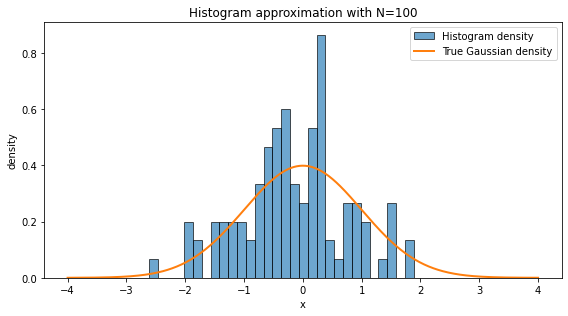
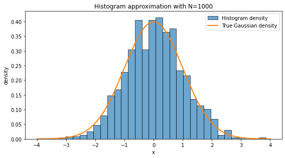
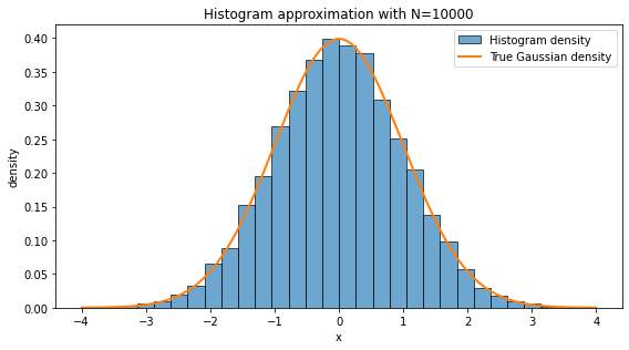
A histogram approximates the probability distribution of data. With more samples, it resembles the A histogram is one of the simplest ways to turn data into a picture. We divide the real line into bins and count how many data points fall inside each bin. If we normalize the histogram as a density, the total area of the bars is approximately one.
A histogram approximates the underlying probability distribution, but the approximation depends on two things:
Sample size: with more data, random fluctuations become smaller.
Bin width: very wide bins hide structure; very narrow bins can look noisy.
In high-energy physics, histograms are everywhere: invariant mass distributions, transverse momentum spectra, missing energy distributions, angular variables, classifier outputs, and many others. In a loose sense, a large part of statistical modeling is the attempt to understand the function behind the empirical histogram.
np.random.seed(42) # For reproducibility

for N in [10, 100, 1000, 10000]:
    data = np.random.normal(loc=0, scale=1, size=N)
    fig, ax = plt.subplots(figsize=(8, 4.5))
    ax.hist(data, bins=30, density=True, alpha=0.65, edgecolor="black", label="Histogram density")

    x = np.linspace(-4, 4, 500)
    ax.plot(x, norm.pdf(x, 0, 1), linewidth=2, label="True Gaussian density")

    ax.set_title(f"Histogram approximation with N={N}")
    ax.set_xlabel("x")
    ax.set_ylabel("density")
    ax.legend(loc="best")
    plt.tight_layout()
    plt.show()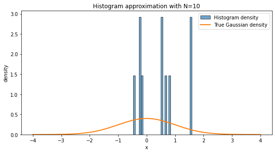
❓ Exercise
Q4. Why does the histogram with look so different from the histogram with ?
Click to show answer
With N=10, there are too few samples to capture the underlying distribution. The histogram is dominated by statistical fluctuations. With N=10000, the empirical frequencies are much closer to the true probabilities, so the histogram looks smoother and more Gaussian.
This is the practical content of the law of large numbers: empirical averages and empirical frequencies stabilize as the number of samples becomes large.
Surprise, entropy and gini index
Surprise (Self-Information)
Surprise is the measurement of how “unexpected” an event is. If an event is very probable, it should not surprise us much. If an event is very rare, it should surprise us a lot.
Mathematically for a event with probability it could have been , but to allow “zero” surprise for certain event, the surprise (or self-information) is defined as
This definition has three nice properties:
if , then : a certain event carries no surprise.
if becomes smaller, becomes larger;
independent surprises add, because .
Shanon entropy
Entropy is the average surprise across all possible outcomes.
For a random variable with outcomes and probabilities , Shanon entropy is defined as
Higher entropy --> more uncertainty; lower entropy --> less uncertainty
Gini index
Taking is computationally more taxing and therefore most of the times we use different other functions or formulas to quantify same thing as entropy.
To measure the impurity of a dataset, we use Gini index. Gini index is especially common in decision trees. For a dataset with classes, let be the fraction of samples in class . Then
One way to read this formula is:
is the probability that two independently drawn samples from the node have the same class.
Therefore is the probability that two independently drawn samples have different classes.
So Gini impurity becomes larger when the classes are more mixed.
❓ Exercise
Q5. If all samples belong to the same class, what is the Gini index?
Click to show answer
If all samples belong to the same class, one probability is 1, and all others are 0. Therefore,
This is exactly what we want: a perfectly pure dataset has zero impurity.
import math

def normalize_probabilities(probabilities):
    """Return a normalized probability vector and check that it is valid."""
    probs = np.asarray(probabilities, dtype=float)
    if np.any(probs < 0):
        raise ValueError("Probabilities must be non-negative.")
    total = probs.sum()
    if total <= 0:
        raise ValueError("At least one probability must be positive.")
    return probs / total

def calculate_surprise(probability):
    """Surprise of one event, measured in bits."""
    if probability == 0:
        return float('inf')
    return -math.log2(probability)

def calculate_entropy(probabilities):
    """Shannon entropy of a probability distribution, measured in bits."""
    probs = normalize_probabilities(probabilities)
    return float(-sum(p * math.log2(p) for p in probs if p > 0))

def calculate_gini(probabilities):
    """Gini impurity of a probability distribution."""
    probs = normalize_probabilities(probabilities)
    return float(1 - np.sum(probs**2))

def plot_distribution_metrics(probabilities, title="Distribution metrics", class_names=None):
    """Plot probability, surprise, entropy, and Gini in clear separate panels.

    This version avoids overlapping labels by using separate figures and explicit spacing.
    """
    probs = normalize_probabilities(probabilities)
    n = len(probs)
    if class_names is None:
        class_names = [f"Class {i+1}" for i in range(n)]

    entropy = calculate_entropy(probs)
    gini = calculate_gini(probs)
    surprises = np.array([calculate_surprise(p) for p in probs])

    # Figure 1: probability distribution
    fig, ax = plt.subplots(figsize=(8, 4.5))
    bars = ax.bar(class_names, probs, edgecolor="black")
    ax.set_ylim(0, max(1.0, 1.15 * probs.max()))
    ax.set_ylabel("Probability")
    ax.set_title(title + "\nProbability distribution")
    ax.bar_label(bars, fmt="%.3f", padding=3)
    plt.xticks(rotation=20, ha="right")
    plt.tight_layout()
    plt.show()

    # Figure 2: surprise values
    finite_surprises = surprises[np.isfinite(surprises)]
    cap = 1.0 if len(finite_surprises) == 0 else max(1.0, finite_surprises.max() + 1.0)
    plot_surprises = np.where(np.isfinite(surprises), surprises, cap)

    fig, ax = plt.subplots(figsize=(8, 4.5))
    bars = ax.bar(class_names, plot_surprises, edgecolor="black")
    ax.set_ylabel(r"Surprise, $-\log_2 p$")
    ax.set_title("Surprise of each event")
    for i, (bar, val) in enumerate(zip(bars, surprises)):
        label = r"$\infty$" if not np.isfinite(val) else f"{val:.2f}"
        ax.text(bar.get_x() + bar.get_width()/2, bar.get_height(), label,
                ha="center", va="bottom", fontsize=10)
    plt.xticks(rotation=20, ha="right")
    plt.tight_layout()
    plt.show()

    # Figure 3: summary impurity measures
    fig, ax = plt.subplots(figsize=(6.5, 4.0))
    metric_names = ["Shannon entropy\n(bits)", "Gini impurity"]
    metric_values = [entropy, gini]
    bars = ax.bar(metric_names, metric_values, edgecolor="black")
    ax.set_title("Summary of uncertainty / impurity")
    ax.bar_label(bars, fmt="%.3f", padding=3)
    ax.set_ylim(0, max(1.0, 1.2 * max(metric_values)))
    plt.tight_layout()
    plt.show()

    print(f"Normalized probabilities: {np.round(probs, 4)}")
    print(f"Shannon entropy = {entropy:.4f} bits")
    print(f"Gini impurity   = {gini:.4f}")
# Example 1: Equal probabilities.
# This is maximally uncertain for five classes.

probabilities_1 = [0.2, 0.2, 0.2, 0.2, 0.2]
plot_distribution_metrics(probabilities_1, title="Example 1: Equal probabilities")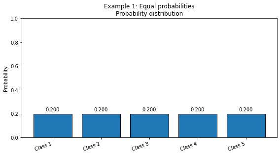
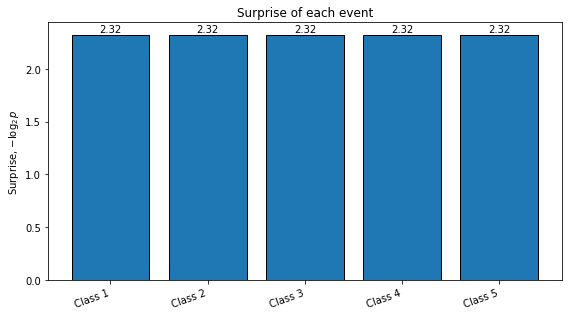
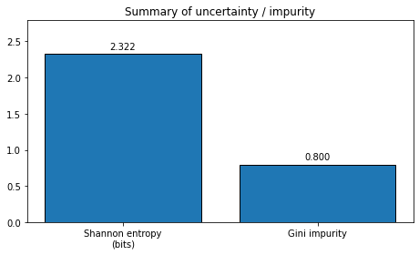
Normalized probabilities: [0.2 0.2 0.2 0.2 0.2]
Shannon entropy = 2.3219 bits
Gini impurity   = 0.8000
# Example 2: Unequal probabilities.
# One class dominates, so uncertainty is lower.

probabilities_2 = [0.7, 0.1, 0.1, 0.05, 0.05]
plot_distribution_metrics(probabilities_2, title="Example 2: Unequal probabilities")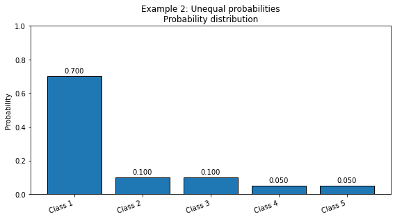
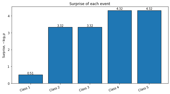
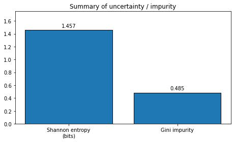
Normalized probabilities: [0.7  0.1  0.1  0.05 0.05]
Shannon entropy = 1.4568 bits
Gini impurity   = 0.4850
# Example 3: Almost pure distribution.
# The first class is almost certain; the zero-probability events have infinite surprise,
# but they do not contribute to entropy because p log(p) tends to zero as p -> 0.

probabilities_3 = [0.99, 0.005, 0.005, 0.0, 0.0]
plot_distribution_metrics(probabilities_3, title="Example 3: Almost pure distribution")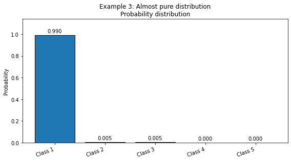
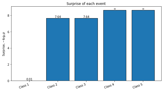
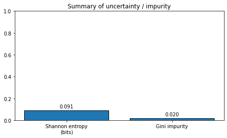
Normalized probabilities: [0.99  0.005 0.005 0.    0.   ]
Shannon entropy = 0.0908 bits
Gini impurity   = 0.0198
❓ Exercise
Q6. For different situations that you can think of, do a quantitative analysis of Gini index vs Shannon entropy.
Try at least these four probability distributions:
: perfectly pure.
: one dominant class.
: moderately mixed.
: maximally mixed for four classes.
Click to show answer
For the pure case, both measures are zero:
For the uniform four-class case,
and
Both entropy and Gini increase as the distribution becomes more mixed. They do not have the same numerical scale, but they usually rank impurity in a similar intuitive way.
You can try the following code to display the answer:
examples = {
    "pure [1,0,0,0]": [1.0, 0.0, 0.0, 0.0],
    "dominant [0.7,0.1,0.1,0.1]": [0.7, 0.1, 0.1, 0.1],
    "mixed [0.4,0.3,0.2,0.1]": [0.4, 0.3, 0.2, 0.1],
    "uniform [0.25,0.25,0.25,0.25]": [0.25, 0.25, 0.25, 0.25],
}

print(f"{'case':35s} | {'entropy (bits)':>14s} | {'gini':>8s}")
print("-" * 65)

for name, probs in examples.items():
    print(f"{name:35s} | {calculate_entropy(probs):14.4f} | {calculate_gini(probs):8.4f}")